How Data Visualization Leads to Making Better Business Decisions
Nowadays more companies see the pressing need to take a data-driven approach to their business. Big data usage and data-driven became the popular advantages organizations praise. But with more data, we are able to collect, the harder it is to read the important one measurements and to derive valuable insights. We still thriving to make […]
Nowadays more companies see the pressing need to take a data-driven approach to their business. Big data usage and data-driven became the popular advantages organizations praise. But with more data, we are able to collect, the harder it is to read the important one measurements and to derive valuable insights. We still thriving to make actual use of the collected data. That is why it is so helpful in the world of numbers. Data visualization leads to conducting insights easier and as a result, making better business decisions.
In this article, I will share with you:
- Why data-driven decisions are better for your business
- How data visualization can help in decision-making
- What are the benefits of data visualization
- What tools you can use to visualize your data.
So, let’s get into data visualization and its benefits for your business!
Data-Driven Decisions Make Your Business Better
Data-driven is a really trendy phrase nowadays. It stands for collecting data, measuring goals, analyzing patterns and derive insights into the particular process or project in the company. Moreover, it helps in making better business decisions, like to develop a new strategy for one of the services your business provides. Or, to remove a few products from your offer because they do not drive interest and sales.
The essence of a data-driven approach lies in consistency and willingness to grow wisely.
Thanks to it, companies can create new opportunities for themselves, optimize current actions, produce more revenue and predict future users’ behaviors and trends. Moreover, it allows your business to be more flexible. Companies that incorporate a data-driven approach usually treat information as a valuable asset and thrive better than their competition.
Data Visualization in Making Decisions – How Does It Help?
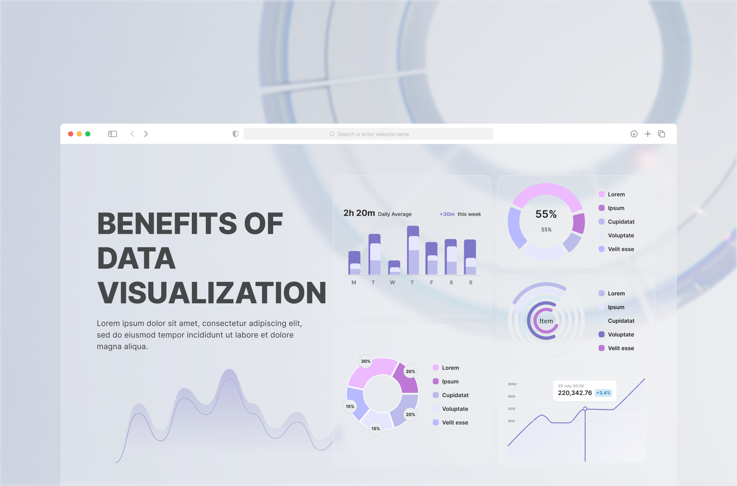
All kinds of visualizations like pictures and graphs make everything easier to comprehend. That is the reason behind creating data visualizations. They allow analysts to derive more and better insights. A great variety of information forms can complement each other in graphic form. Thanks to them we can easily identify patterns, point out the areas with potential, indicate the weakest spots, and most importantly recognize the best formulas. Your business can benefit a lot with well-created data visualizations.
To make the most of data visualization, you need to take care of a few important aspects:
- The data must be shown with the background information that puts the graphs into context – that is how everyone will be able to understand everything easily.
- Data visualizations should present key data in a way that indicates the clear course of actions.
When data visualization includes these aspects, analysts are able to put insights into action.
Extra Benefits of Data Visualization
Above all, data visualization, beyond making better decisions, can improve many aspects of work in your organization.
1. Fast Response Times
Data visualization gives the data to the users’ allowing them to quickly identify issues and improve response or reaction times. It is a major advantage for companies that want to save time and react faster being more flexible.
2. Improved Work Simplicity
Visualizations allow users to get the big picture and allow them to see the details at the same time. When users interact only with relevant data, their work is simplified. They are able to focus on what is important at the moment.
3. Easy Patterns Recognition
Try to find a pattern while checking hundreds of lines in an Excel spreadsheet or a few different data sets. It is just almost impossible, and it takes a lot of time! When you have a visualization of data, you can better absorb it and easily recognize new paths. As a result, you are able to identify patterns, new trends, and even predictions.
4. Improved Collaboration Between Teams
When all of the teams at your company can see the same data visualizations that are easy to understand, they are more often on the same page regarding the insights conducted by the data. As a result, it makes collaboration between teams smoother as they are starting with the same knowledge of collected data. Therefore, they can decide on the next steps and discover solutions more quickly.
5. Combining Data from Various Sources
And last but definitely not least, data visualization allows you to see data from various sources. It is difficult to see if your Facebook and Instagram campaigns are successful-looking only at Facebook Business Manager analytics. So if you would like to compare them with data from your CRM, Google Analytics or other sources, it is best to see them on a well-done and easy to comprehend data visualization.
Data Visualization Solutions
You know already that your business needs data visualization to make better decisions but you are not sure how to incorporate it into your company. There is a great variety of different solutions and tools you can use. Most of them are easy to access, therefore you can start using them really soon! Let’s see what solutions your business can acquire.
Tableau Software
Tableau is an interactive data visualization software. It allows you to simplify raw data into an understandable format. You can create data visualization in the form of dashboards and worksheets. It is commonly used in the Business Intelligence Industry. Although the tool is not free of charge, it is worth the investment. Moreover, Tableau encourages you to join its community and learn even more about data visualization. You can share your visualizations online or on the server – you can choose if it is public or not. If you are not convinced, take a look at our data visualizations created with Tableau.
Microsoft Power Bi
Power BI is a business analytics service provided by Microsoft. It allows you to create interactive visualizations. What is more, it provides business intelligence capabilities with an interface simple enough for end-users to create their own reports and dashboards. Power Bi is not a free tool but it allows you to create a lot for a reasonable price.
Google Data Studio
This is a free tool provided by Google. Data Studio gives you everything you need to turn your analytics data into informational, easy to comprehend reports through data visualization. The reports are easy to read and share, customizable to each of your clients if you work with more than one company. Moreover, you can choose how you want to showcase the data – bar graphs, charts, line graphs, etc. You are able to change fonts and colors and brand the reports with the logo. It is one of the most common tools analysts work with nowadays. In addition, if you want to know more about Data Studio, check out my blog posts on this tool.
Qlik
Qlik is a business intelligence and visual analytics platform you can try for free. It is an interactive data visualization tool that enables users to import and aggregate data from different data sources. They can further use the data visualization tools of the software to shape raw data into meaningful information. The two main products QlikView and Qlik Sense serve different purposes running on the same engine. In QlikView, the users pursue their day-to-day tasks, analyzing data with a slightly configurable dashboard, most of the data is somehow “pre-canned”. On the other hand, Qlik Sense allows associating different data sources and fully configuring the visualizations, allowing to follow an individual discovery path through the data. The company’s official definition is “QlikView is for guided analytics; Qlik Sense is for self-service visualizations”.
D3.js
If you want to have full control of your data visualization or your application, d3.js is a perfect choice. It is the best data visualization library. D3.js runs on JavaScript and uses HTML, CSS, and SVG. It is an open-source and applies a data-driven transformation to a webpage and allows you to create quickly beautiful visualizations. D3.js combines powerful visualization and interaction techniques with a data-driven approach to DOM manipulation. Therefore, it gives you the full capabilities of modern browsers and the freedom to design the right visual interface for your data. It also provides great features for interactions and animations.
Python as a Data Visualization Tool
Python is a programming language commonly used by data analysts. You can create with it amazing data visualizations. What is more, it is designed with features to facilitate data analysis and visualization. This programming language offers multiple great graphing libraries that come packed with lots of different features. No matter if you want to create interactive, live or highly customized plots, Python has an excellent solution for you and your business.
To get a little overview, take a look at a few popular plotting libraries:
- Matplotlib – it provides lots of freedom;
- Pandas Visualization – it has easy to use interface, built on Matplotlib;
- Seaborn – it has a high-level interface and has great default styles;
- Ggplot – it is based on R’s ggplot2 and uses Grammar of Graphics;
- Plotly – using it you are able to create interactive plots.
Incorporate Smart Data-Driven Approach to Your Company
Data visualization enhances analytical thinking, deriving insights and making quick data-driven decisions. It is just a wise way to improve a lot of aspects of your business so it can thrive better. Data visualization is essential nowadays. Especially, if you operate in a highly competitive market or industry. If you are not sure about it yourself, seek for the analytical partner that can introduce you to data visualization. Just do not neglect the power of data visualization and its benefits!
more
Related blog posts

A complete guide to AI search platforms. How do they work and how to start generating traffic?
18 May 2025 • Insightland

Content Optimization. Fashion Industry in Ecommerce in Search of Lost Traffic. Part 2
24 Apr 2020 • Insightland